Summer Seaside Fun

I’ve been pushing on with pattern design work I just didn’t get around to.

One of my favourite undeveloped ideas was the concept of the reality of seaside life – inspired in part by where I am lucky enough to live now – New Brighton – for a long time a forgotten and dilapidated typical seaside resort in Merseyside; the harsh realities of very real photographs were famously documented by Martin Parr in 1985 with his book ‘The Last Resort’ (Magnum Books). 31 years has seen a lot of change – although a few of the buildings featured remain, the area over the last 10 years has seen great redevelopment and transformation and has taken on a completely new and progressive atmosphere.

Everyday I am inspired by the place and in part I’m sure this is related to knowing both the triumph of once being a national top holiday destination but also the fight it has put up to reinvent itself after much neglect.

Out of this rose the idea of ‘Seagulls and Sandwiches’. The idea that when you’re sitting enjoying the seaside air a seagull will come along with its beady eyes and snatch your anticipated dinner.

I started with a linocut print. Ive then digitally coloured and edited to get a repeat pattern and then chose elements of this with the same colour palette to form a more cohesive collection.


I experimented with colours – I wanted to avoid the typical seaside and nautical colours – the stereotypical nautical blue and white and beach sandy yellow with a light blue sky. I settled on brighter more vibrant yellow and blue and just love the way the 2 work together.


A little refinement of colours and taking beady eyes and sandwich details out I made covers for 3 notebooks and a tea towel with packaging sleeve.

s and s teatowel packaging5


I’m glad I got round to doing this. I am hoping to run with this and produce some tea towels and notebooks for sale through my etsy shop soon. http://www.etsy.com/shop/hairypearpress  as well as develop the range to include more patterns. Next up: fish and chips.

Pat on the back time …

Last week I gave the presentation for the end of the Responsive Professional Practice Own Brief : Surface Pattern Design. It was a great chance to look back and see what I had produced and break it down into the visible steps of the design cycle, even if it was a bit retrospectively in places. Bringing it all together was satisfying – being able to wrap up a lot of work. Ive struggled with the digital side pattern development, so if felt like a mini achievement.

final presentation pdf

I suppose a lot of the design cycle including evaluating and redesign is instinct – if it doesn’t work ‘try and try again’. The more difficult bit is probably seeing it doesn’t work. But I now have a great step by step reference for if I get stuck in a rut – and I can cycle back to the beginning.

I feel like I have learnt a lot in terms of digital skills as well as the surface pattern design, trends, products and applications. Comparing the first patterns I designed with the later ones I found it much quicker, the repeat matches better and I’ve got a better understanding of what is possible with digital editing. I also later in the work produced patterns entirely using illustrator, by using brushes, with textures, and colour palettes.

I really hope to be able to design several new patterns over the summer break, with a bit more of a ‘collection’ in mind of complimenting designs, colours and scales –  and would also really love to do some work experience in this area.

I’ve now got a database of contacts, designers, inspiration, mood boards, printers, merchandise companies, trade fairs, local and national events, and a few retailers, as well contacts through social media on pinterest, instagram and Facebook (@hairypearpress) which will help me keep up to date as well as give me an idea of potential design opportunities locally.


Lets make

Pattern Brief: bearing in mind the time to complete the brief  I’ve decided to focus on 1 product per pattern range. I have split the designs up by the design process;

honesty – ink drawing = screenprinted fabric,

I scanned in a hand-drawn sketch and edited in Ai to produce a repeat pattern square swatch that seemed to work well for fabric. I kept this a single colour to keep the design and printing simple, but also felt the design was strong enough and multiple colours might detract from the simplicity and fluidity of the hand drawn image. I then produced a screen and printed some fabric (link).


cupcake collages = giftwrap, 

Thanks to spoon flower. From acrylic paint I cutout and collaged illustrations, around a teatime theme. I selected 2 cupcake illustrations as the strongest and generated a random repeat pattern using a square swatch technique in illustrator, editing the colours to work together slightly. I uploaded this to spoon flower and they produced the digitally printed roll of gift wrap. I used this to wrap boxes and took and edited some product shots using a dSLR and Photoshop.


waves – linoprint = paper print – I have applied this to a book covers and endpapers.

I’m a big fan of linoprint and really wanted to see about linoprinting onto fabric but also using the lino as a start for digital editing and pattern design.

I quickly found out the at linoprinting directly onto fabric was tricky and time-consuming although nice to have instant results and the effect achieved is completely unique. The larger the block the less prints needed to cover the same area but the larger the block the more likely it is the ink prints unevenly. I made two linoblocks based on a seaside/ nautical theme to echo the shape of waves and printed directly on a dark blue fabric with light blue fabric ink.

However, I’m keen to develop digital editing skills so I scanned in the linoprints and edited them in photoshop. I could then take them into illustrator to develop patterns of various combinations and tiling layouts. I kept colours nautical (blue and white) and printed onto A3 paper. I used the paper while researching bookbinding to produce 2 books using the pattern – as a front and back cover and inside as end pages. One book was a perfect bind and the other was a simple sewn binding.


Ive loved every minute of this brief. Its given me a great understanding of the complexities of surface pattern design, but also helped me to know more about this side of graphic design. Its been really helpful to make new contacts, push myself to try new techniques (screen printing and bookbinding), as well as the editing and production side using photoshop and illustrator – using tutorials from ‘Digital Fashion Print with Photoshop and Illustrator’ by Kevin Tallon (2011, Batsford: London) . Ive also found it really useful to learn about generating product shots and had to think about camera, camera setting, lighting, any additional props and post processing in photoshop.


Patterns : use them or lose them

Continuing with the pattern design brief I’ve now started to look to applying the best pattern designs to products (design refinement and exploration of media and aesthetic options).

I’ve researched a range of designers, focussing on how the patterns are used. What products translate well to mainstream commercial pattern use – possibilities are wide ranging from textiles, clothing, kitchen products (tea towels, oven gloves, aprons), to plates mugs, duvet covers, pillowcases, cushion covers, and even right down to smaller merchandise such as greeting cards, notebooks, keyrings, pencil cases, pencils, mobile phone cases and  even cosmetics (packaging) and temporary tattoos.

Ive found inspiration through visiting Spring Fair retail show (Birmingham NEC) and brands/ designers such as http://www.theprintedpeanut.co.uk/, http://www.victoriaeggs.com, http://www.loveyournation.co.uk,  and looking to the more well established mainstream designers (Cath Kinston, Orla Kiely) and their range of products in the high street stores (John lewis). Victoria Eggs has a great range of patterns which are nicely applied to a range of popular products.

This slideshow requires JavaScript.


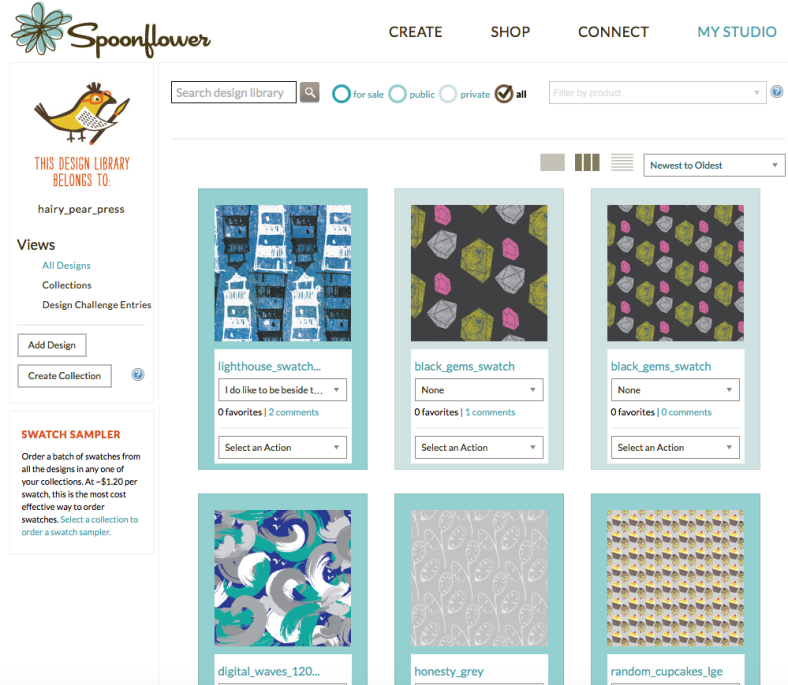
Spoonflower (www.spoonflower.com/UK‎) has been a great resource for pattern research, but also they can produce small fabric swatches, larger fabric rolls, giftwrap and wallpaper.  Ifound it really useful to upload jpeg swatches to ‘My studio‘ and keep a swatch library for the designs completed during this brief (@hairypearpress).

Screen Shot 2016-05-07 at 22.57.56

Since I’ve explored designs using a range of techniques and media like Acrylic cut out collages, ink drawings, watercolour and linoprint, its been great to be able to experiment and then refine ideas. I’ve found it challenging with processing through Adobe illustrator and Adobe Photoshop, particularly in getting the swatch and the pattern to repeat correctly.

I’d really love to see my designs applied to a range of products, but looking at the examples above most limit themselves to a few main items. e.g. Victoria Eggs breaks it up into Kitchen, Homeware, Gifts, Bags and Cards and Wrap. Some ranges have more products than others – probably the better sellers.


A Brief update: Product Shots

Surface Pattern Brief: An Update

Over the last week Ive produced a repeat lino block pattern using a small block printed multiple times (not the quickest, most efficient production method) as well as the screen printed textiles previously. I’ve realised that hand printing textiles needs the largest block/ repeat swatch possible to make it most efficient.

Ive now started to think about displaying and presenting patterns, fabric items, and being appropriate to their commercial applications and online presence. I was very grateful to learn a few photographic tips today for products shots and how to go about basic post processing within Photoshop.

I learnt about lighting for shots, SLR settings, white balance, hue and saturation, RAW image acquisition, and that desaturating the background helps the object stand out more. Up to now I have been using my iPhone, which although pretty convenient and good resolution doesn’t allow the same processing and anyway, I thought it was useful to develop new skills to be able to present my products at their best in future.


However, I also realised that my trusty digital SLR is ancient – now at least 10 years old – but now won’t even talk to a mac. They don’t get on. I can sympathise.


Spoonflower

Why didn’t I know about this before?

Continuing pattern development I’ve been following tutorials for creating pattern swatches using Adobe Illustrator as a grid repeat – matching the edges exactly for a seamless repeat. Technically finding it quite difficult to copy the exact swatch. Generating a random pattern takes more effort than the grids and bricks – for one it can’t be done by the computer programme – ensuring there is enough random rotation and placement of each object is tricky to get the aesthetic balance right – I just eyeball it.


A bit of a discovery last week – I was aware of Spoonflower as an online resource for new patterns and original designs through social media – instagram and facebook, but I hadn’t realised the design studio platform and ability to submit designs for review and manufacture.

Ive uploaded the few patterns I produced so far – Its a great online resource of patterns and designers offering both the chance to manufacture small quantities of your designs and also sell the designs directly, generating commission ($$$). It also offers a bit of feedback – designs made public are available for comments and eventually sales as an indicator of popularity.  What a find.


Who is Herb Anthony?

As part of a new brief I have been researching textile design and surface pattern. I was lucky enough to be able to visit a collection of amazing prints and patterns whilst visiting  The Whitworth Art Gallery in Manchester  (http://www.whitworth.manchester.ac.uk).

From the full height rolls of wallpaper hung in a large treble height space, you could really appreciate the detailing, attention to repeat print and the efforts involved in the manufacture of these lengths of paper. The designs themselves were all great examples with 1950-60s mid century designs by Roger Nicholson, Audrey Levy and others, but what stood out, personally, and most consistently was an affinity for the work of Lucienne Day.

Lucienne Day (1/1/17 – 30/1/10) seemed to be a truly amazing woman. She became one of the most well known textile and pattern designers ever know, and working within a time with much more restrictions for women makes her even more inspirational. She was a prolific designer, each new pattern stepping in a new direction from the last. Her professional relationship with Heals brought modern art and design to the people. The general public had a chance to buy more reasonably priced textiles rather than expensive one-offs.

She used organic forms as inspiration – flowers, stalks, grasses, seeds, however the design involved is modern, even by todays standards. Her breakthrough design was ‘calyx’ in 1951.

olive-calyx-by-lucienne-day-textile-bigger

I love her brilliant use of colour. Each design and the colour ways look like they are carefully chose to reflect the taste of the time; commercial, but never bland, boring or predictable.

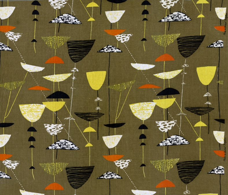
The accents of pink and yellow in the dark green sample below, as an example. There was a length of this textile design (Herb Anthony) hung at the Whitworth which caught my eye.

Herb Anthony 1956 designed by Lucienne Day in different colorways


Most information about Lucienne Day also makes reference to her designer husband Robin Day (a furniture designer), who she met and married early in her career. Parallels are drawn with Charles and Ray Eames, about the designing relationship (who influenced who?) but I think Lucienne Day had to work hard to prove herself as a designer in her own right, becoming well known in the 1950s which was still probably a time of oppression and struggle for equality for women. She was also a mother and that alone can be difficult, making her whole life an inspiration.

I have long been a fan of mid century modern design all round for textiles and patterns, posters book design – I just love the shapes, the colours and probably in part the nostalgia, but hadn’t quite realised quite how much of what I had seen is directly attributed to Lucienne Day.  She died in 2010 at the age of 93.

IMG_1337


My next self directed brief involves pattern design. I am now extremely humbled and very daunted by the task, but equally inspired. I hope to produce a range of patterns and colour ways appropriate to commercial manufacture. This insight has given me a great starting point and helped define the direction I’d like to take.