Children’s books…. and shelving it.


Aside from the next brief I’ve been independently working on a dandelion lino piece  which I originally planned to be a multi block multicolour print. I had shelved it because I wasn’t happy with the way it was going and was going have a think about it and revisit it someday.

My tutor showed me a collage technique with acrylics, cardboard mark making and paper cutout- in particular referencing a personally influential and gorgeously illustrated book – ‘The Very Hungry Caterpillar’, designed and illustrated by Eric Carle (1969)

HungryCaterpillar

I had also been enjoying the illustrations in another great book with a more painted but similar blocky/ cut out effect. ‘There a wardrobe in my monster’ by  Adrienne Geoghegan and illustrated by Adrian Johnson.

Working with just a Phthalo Green acrylic tube and yellow medium ago Liquitex ink made me think back to the dandelion . I explore textures of application, mixing paint and ink, layering patterns and collage. I loved the combination of bright spring time colours and I think it worked well.


I now need to consider how to translate this into pattern. and how to I capture this – do I emphasise the 3D / collage effect or try to get the textures flat? Im keen to try out more ink based work – drawing with a pipette, and trying other tools for application and see can be produced.

Embracing creativity:

I’m really enjoying finally having a chance to legitimately be creative – to be able to justify indulging myself in a lifelong awareness and appreciation of design and to actually get some ideas out my brain, try them out and (maybe) turn (some of) them into work is what I need. This mainly involves messy piles of random’Post its’, or my sketchbook/ diary for capturing those unlikely moments of inspiration and make sense of them later.

As an aside this has led me to reflect on the variety seen in people and what motivates them- what they’re passionate about. Personally, I am very aware of aesthetic and design. Always have been. I like arranging things and I like them to look nice. I can see that not everyone hold the same priorities and can accept that, but it makes me happy.

Add in a longstanding love for typography, paper crafts, posters, books, pattern and all things print and I ‘m happy that this (albeit finally) led me to graphic design.

Ive also realised I like to make things – liking to have a tangible object or product to show at the end of a days work is just satisfying. To say, maybe quite naively,”Look – what I made”. I realise that this isn’t everyones outlook on life, but I think its important to understand myself and why it motivates me to do graphic design and be good at it.

Simple really. But I can’t put it better than Saul Bass

” I want everything we do to be beautiful. I don’t give a damn whether the client understands that that’s worth anything, or that the client thinks it’s worth anything, or whether it is worth anything. It’s worth it to me. It’s the way I want to live my life. I want to make beautiful things, even if nobody cares.”. 


Pesky Patterns


From the last few briefs I already know I struggle with choice, but this is more wide open than ever – the brief is completely self directed – can be wherever we want to go and we’ve got a lot of time to fill.  Sitting down and writing the brief was a challenge in itself. what do I really want to do?

After initially deciding on pattern design I then felt I’d like to look it exploring website design and web identity branding for Hairy Pear Press -a practical live brief to refine the printmaking side of my work, but following more procrastination I went with my gut reaction. What I was interested in doing. Patterns and Print.  Also, I like that there is more to explore, and need to just embrace not knowing where I’m going to end up with it yet.

IMG_1278


Decisions are hard because its easy to think of it as we’re closing doors to the other options, but the better way to think about it is that its opening new doors, moving on and of course, around the ever refining design cycle.


Then I realised patterns are everywhere, in just looking around for a few minutes we see examples of so many different patterns, different origins, techniques, production – so much research!


After being a bit overwhelmed  I’ve now broken it down into small pieces with the help of the design cycle and now have a plan and a timescale until the final deadline and presentation in May.

  1. Understand the brief (easier than usual – I should because I wrote it)
  2. Research (primary, secondary), and more research
  3. Idea Generation  – which is what I’m doing at the moment. In truth this works hand in hand with research, and finding what direction to take it.

Ive been looking at themes – geographical schemes, a collection based around town, countryside, seaside, city, nautical. Another recurring source of inspiration the we see throughout design is organic based designs, flowers, plants, trees, and also including birds, animals. Flowers are tempting, but much has been done already. Part of me things maybe a bit ‘safe’? predictable? harder to put your own design aesthetic into such a well covered theme? One option is to concentrate on the flowers that aren’t often featured – weeds? I love the bright yellow dandelions that add interest within an otherwise plain green grass space. Grasses, seeds, bulbs. Vegetables. …


I really want to explore household items, kitchen utensils, tea, teabags, coffee, (I’m thinking of making tea towels as the final product), cutlery, crockery, bottles, jars as well as maybe more traditionally gender based collections- DIY tools and make up. Watch this space…


Who is Herb Anthony?

As part of a new brief I have been researching textile design and surface pattern. I was lucky enough to be able to visit a collection of amazing prints and patterns whilst visiting  The Whitworth Art Gallery in Manchester  (http://www.whitworth.manchester.ac.uk).

From the full height rolls of wallpaper hung in a large treble height space, you could really appreciate the detailing, attention to repeat print and the efforts involved in the manufacture of these lengths of paper. The designs themselves were all great examples with 1950-60s mid century designs by Roger Nicholson, Audrey Levy and others, but what stood out, personally, and most consistently was an affinity for the work of Lucienne Day.

Lucienne Day (1/1/17 – 30/1/10) seemed to be a truly amazing woman. She became one of the most well known textile and pattern designers ever know, and working within a time with much more restrictions for women makes her even more inspirational. She was a prolific designer, each new pattern stepping in a new direction from the last. Her professional relationship with Heals brought modern art and design to the people. The general public had a chance to buy more reasonably priced textiles rather than expensive one-offs.

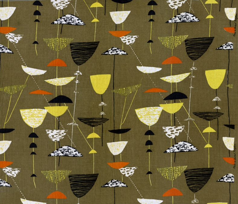
She used organic forms as inspiration – flowers, stalks, grasses, seeds, however the design involved is modern, even by todays standards. Her breakthrough design was ‘calyx’ in 1951.

olive-calyx-by-lucienne-day-textile-bigger

I love her brilliant use of colour. Each design and the colour ways look like they are carefully chose to reflect the taste of the time; commercial, but never bland, boring or predictable.

The accents of pink and yellow in the dark green sample below, as an example. There was a length of this textile design (Herb Anthony) hung at the Whitworth which caught my eye.

Herb Anthony 1956 designed by Lucienne Day in different colorways


Most information about Lucienne Day also makes reference to her designer husband Robin Day (a furniture designer), who she met and married early in her career. Parallels are drawn with Charles and Ray Eames, about the designing relationship (who influenced who?) but I think Lucienne Day had to work hard to prove herself as a designer in her own right, becoming well known in the 1950s which was still probably a time of oppression and struggle for equality for women. She was also a mother and that alone can be difficult, making her whole life an inspiration.

I have long been a fan of mid century modern design all round for textiles and patterns, posters book design – I just love the shapes, the colours and probably in part the nostalgia, but hadn’t quite realised quite how much of what I had seen is directly attributed to Lucienne Day.  She died in 2010 at the age of 93.

IMG_1337


My next self directed brief involves pattern design. I am now extremely humbled and very daunted by the task, but equally inspired. I hope to produce a range of patterns and colour ways appropriate to commercial manufacture. This insight has given me a great starting point and helped define the direction I’d like to take.


Real Art : Special Collections

Sometimes you just come across something and find it completely inspirational. The power of the a real object is irreplaceable even by all the advantages of the internet functions and accessibility to information. This is about provoking feelings. In the same way ‘print isn’t dead’,  to actually see close up, feel and hold original artwork is, as I found last Friday, really is something else.

Visiting the MMU special collection I felt incredibly lucky to be able to delve into some of the original pieces, rough sketches, and more structured diaries and sketchbooks of Barnett Freedman and to start with Paul Hogarth.

Seeing how very loose sketches from all corners of the world were transformed into fine illustrations for Graham Green, along with detailed diary entries recording the tiniest details was incredibly insightful. Having started to look at Modernism and working our way forwards, I found it interesting to see more up to date work, and probably significantly work from my lifetime.

I loved seeing the stepwise development of the idea – The ‘Its a Battlefield’ cover illustration I saw develop through sketchbook entries and rough notes transformed to a rough sketch, layout and then the final piece, actually there, in front of me.

1971 Penguin Books It's a Battlefield by Graham Greene

His architectural drawings and the detail involved was great to see – seeing the workings out along with the final stamps, but particularly liked the Alexandra Palace item. It got me thinking how we rely heavily on the internet for defence images currently, whereas the photography that he would have relied on was more time-consuming, expensive, and unpredictable (bearing in mind mis takes (i.e. double/ over/ under/ exposures) processing fees, times and film costs ) but maybe more honest? I didn’t have time to look through his source photograph collection.


Looking at Barnett Freedman – examples of earlier work with book covers, advertising and underground posters. From a printmaking perspective it was lovely to see the detailed makings on the posters made with lithography, as well as the overall effect. Some of the detail on the post office items was lovely to see close up, including the delicately handwritten signature in his own hand.

Equally I particularly amazed by the detail on Barnett Freedman’s Post office signs, and McDonalds Biscuits packaging.

freedmanbig

You could see and feel each letter that had been cut out and stuck down, carefully arranged and minor alterations made. Knowing that designer has spent time carefully arranging this, pre- computer piece. I wondered how he might have taken any criticisms and how he responded to this – were some of the boards later revisions?

I am a great fan of typography  so loved seeing the book covers where Freedman relies heavily on the text and composition – as well as the advertising signs – his individual letter design, shapes and the variations he tried to decide on the final piece was insightful.

edwrard lear

Taking it back to the design process that we cycle around today – made me think even with all the advances – were not all that different, now, and it reinforces how important the process of design is – we probably apply it a lot without thinking but I see now its always worth referring back to for a little reminder.


Penguin Design Brief

As part of responsive professional practice we have been following the penguin design awards brief. I thought I would enjoy this – knowing it is a not only a live brief , but more than that – a competition – gave the whole project a bit of an edge. Initially my research took me through the specified brief and to previous winners – amazing work. Part of me felt how can I compete with that?, part of me stood back in admiration, but once I got over that, picked myself up and started sketching.

I reluctantly chose just one book – knowing the time limits I have – the children’s fiction title ‘Emil and the Detectives’ by Erich Kastner. Im not a ‘reader’ but wanted get the detail out of the pages so read the book cover to cover. I struggled with too many ideas and not knowing which one to run with. Looking back I wish I had somehow been able to spend more time on taking each idea further. I explored fingerprints, the bowler hat, magnifying glass, buildings, moustache, the train, tram, 1920s decor, German fashions, shadows, the money, the characters of Emil and the thief Grundeis. I would have loved more time to make it interactive – a game – search for the bowler hat amidst the busy city (literally what Emil had to do). Treasure hunt for the money – I could see arrows and details in my mind, but planning this out took time I didn’t have. Join the dots , colouring in. Paper craft, origami, 3D effect.  I know my children enjoy it most when a book isn’t just a book.


The cover needed to be literal and any minimalist metaphors needing lateral thinking would be lost on children. I wanted a busy cover to satisfy the busy minds – colour and content took over, to me it seemed to much – but worth thinking about through a childs eyes –  maybe thats what would appeal to them. Would it make it ‘pick-unable’ as per the brief.

I attempted to use my crafting skills as a comfortable start point- this seemed to go well. exploring paper cut (very much in awe of Rob Ryan) my favourite bright colours, risograph and collages (inspiration from Printed Peanut), Linoprint (Chris Brown). Ive long been  fan of Angie Lewin’s organic based woodcuts with the attention to details, but Mark Hearld (love the lino) Jonny Hannah (wow) and all at St Judes press are fast becoming my favourites too. Illustrations (Linzi Hunter) I found harder – people and characters are difficult for me. I found the image of Emil in the past very difficult to bring up to date.

Hand on skills turned to processing this in photoshop. I found this difficult again, but do feel with each brief I learn new techniques and shortcut. More importantly I am learning the potential of what can be done – opening up a whole range of ideas (a bit too many for my mind capacity at times). However, in retrospect I needed to explore potential layout more before jumping in with a favourite. Working through scanning and importing scanned linoprint houses into photoshop was educational (to say the least) along with making the selections and then downloading and arranging them on the given template all this took me a long time – which should have been spent on deciding on layout a bit more. I found it frustrating.

After much rearranging I still wasn’t happy with the layout. Im aware I am a bit of a perfectionist, but equally its difficult to know when to stop tweaking the design – I’ll just try this – no doesn’t work either – OK lets try this …. back to the start. I hope I will develop more instinct with experience.

With the extended deadline this made me make more adjustments. I do think the final piece benefitted from this, and in particular the first crit – I took on board points about business with colour and composition – I took away some houses and resigned a monochrome house colour scheme with accents of yellow. I looked at the text for the title and made and imported my own handwritten font. I rearranged the writing on the spine, for it to stand out better and I explored different shaped ‘hands’ and ‘spot lamp’ as suggested, but still liked the initial ones more.

Still I kept changing things. It was tempting to start again or do one of the other ideas. Very tempting. But in the end I was happy with the way I had refined the idea and just to produce something passable with all the required elements in photoshop was a big enough achievement for me –  Im not so much a perfectionist but I just wanted to do the best I can (remembering theres £1000 at stake here!).

Im looking to submit it. One of my favourite sayings – Nothing ventured, nothing gained.