Briefs are Pants

So in both the modules I’m studying this year we’ve started 2 new briefs in the last few weeks, both of them I’ve discovered are wide open and before anything else can begin I need to decide what I am doing.

I’ve been sort of randomly searching online, following one link to another. Whilst I am learning, reading and researching its expanding my choices more with each click. I feel like it might help tried to bring both briefs around the same subject, but I don’t think thats the point.  Both brief are currently so vast its taking me a bit of time to get down to making decisions.

So Brief 1 : DD2222 : Professional Practice and Work Based Projects; PDP Folio for Life. 

  • is all about PDP (PersonalDevelopment Planning) – the cycle of self reflection and action.
  • developing teamwork, project management skills and good practices.
  • preparing us for a professional working environment (or I guess this could also be called ‘real life’) like understanding materials and processes, studio environments, commercial environments,
  • instilling employability. practice based experience.
  • career planning, networking,

We’ve been asked to think of a question. Any question. Relevant to us, and to research it solve it, present it. (professional inquiry) Essentially, a lot of this brief is self directed. I m finding the freedom to chose a topic exciting, but it seems the more I read the more I find, and instead of narrowing down I’m expanding (again). I know I am the kind of person that needs all the information before making a decision. I’m not the one to come to for snap decisions.

This is a glimpse of where it has taken me so far… a jumbled up expedition into graphic design at the moment. ….

I’ve considered looking at so many areas. Because I currently work, both in terms of my *other* (non design) job and my printmaking [small] business Hairy Pear Press. I have some experience to draw on – should I explore commercial aspects of a small business? networking relevant to this? Product development? I need a more cohesive branding which projects the right image. Should I concentrate on social media? online shop? website? I’m doing a pop up shop locally just before Christmas – should I concentrate on local point of sale opportunities? commercial sales? trade catalogues? wholesale? greeting cards, wrapping paper? digital download sales? tax? business skills?  I’ve always remembered the advice – ‘don’t be a crafter’ – I agree, but how? why not? what the difference between a hobbyist and part time designer? maybe I should look at what makes you ‘a crafter’? how do I not be a crafter?

I’ve long been a fan of children’s books and when I was recently tidying up my Childrens books I realised this is a really interesting area for me – Childrens illustration. I have a few ideas around this I’d like to explore and my current collection of books that ‘the kids aren’t allowed to touch grows’ everyday.

Add this to the penguin brief I’m also thinking about doing – should I look into the world of illustration more, specifically for children. Its a seriously competitive area judging by what I’ve read so far and seems like only the best of the best make it. I’ve been luck enough to see Axel Schaefler’s original drawings of Julia Donaldson’s books a couple of years back, but also when I visited the Scottish National Gallery of Modern Art last month I saw an inspiring exhibition called ‘Picture Hooks’ a mentorship programme set up to encourage new children’s illustrators. I was really taken by the sketchbook work, and in my own design this is an important object (below).

Could I look into sketchbooks and how artists use them? what do they do with them? whats the use? how do we all differ in our approach? One of my favourite go to books for inspiration is Graphic. Inside the sketchbooks of the World’s Great Graphic Designers. Steven Heller & Lita Talarico. Thames and Hudson. and I recently discovered there was a sketchbook reference library. These are treasured items, at least to som, and are quite fascinating glimpses into the mind of design.

More questions than answers. I need to set a deadline for decision making. Just now procrastinating when that might be. End of term 22/12/17 sounds good.

Brief 2: Next Post.

Rules:

I used to play the flute. Before this I used to play the recorders (descant, treble and tenor…not all at once) and classical/spanish guitar. I also played bass guitar (badly) with the height of my talents being Broken Stones by Paul Weller. I digress…. From an early age I was taught to read music and when I reached Grade 5 level I also had to endure countless sessions of unbreakable rules and strict mathematical equations involved in ‘Theory of Music’. argh. That exam still haunts me.

I used to wonder about the great composers (whether it be Handel, Mozart, Chopin, Debussy (legend) to modern day songwriters, like Bowie, Lennon, Reg Dwight, Page/Plant, Brown/Squire) when they wrote a piece, were they consciously thinking about complexities true cadences, chords and the actual notes? Did they picture the music on the score as they wrote? Or did they just play what their fingers told them to (and later its transposed into this thing we call music manuscript). I suspect it was the latter.

My brother taught himself to play guitar. He can’t read music. He taught his fingers to listen. Now he can now just hear most songs once and have a pretty good go at playing it. He’s not bound by the rules of music. Equally my friend plays pipes in an Irish session band – most of the band can’t read music. They hear the key, the rhythm and their fingers ad lib the rest. As someone who can’t play by ear I’m always in awe.

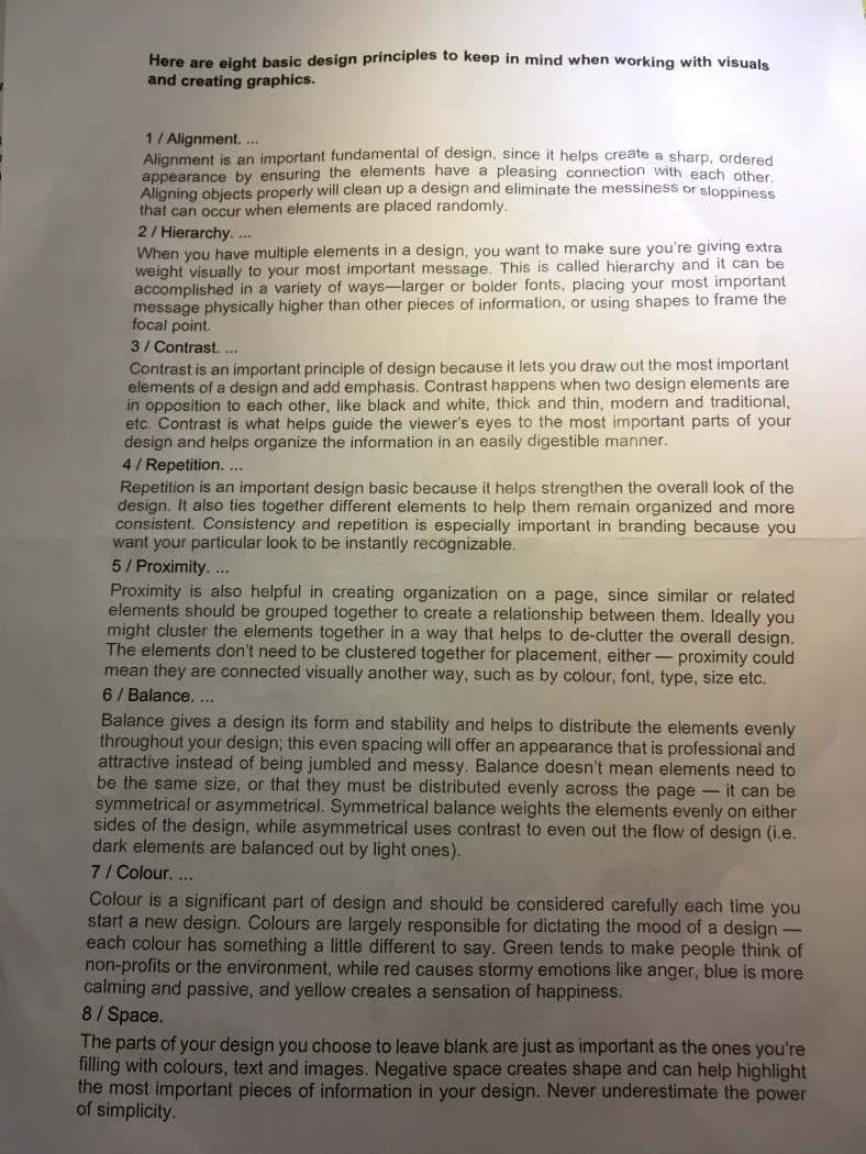
Last week I discovered the 8 ‘principles of design’.

IMG_4384

Alignment! hierarchy! contrast! repitition! proximity!… [are you listening to me?!] balance! colour!… [stand up straight when I’m talking to you!]  space! Seems quite intense.

I hadn’t formally defined these before last week, which did make me wonder if I had missed out some of the basics, but as I read on I realised I knew about them, but just absorbed them without thinking.  I’m not sure I agree with being so regimented –  Surely trying to separate off and count up elements of what is good design so clearly and distinctly is not right? I agree they are all important elements, but in a creative field whether it be art (graphics), music, painting, cooking, writing or any other similar task, I began thinking, if you have learnt something according to rules are you always then going to be constrained by them?

Using a recipe I can make a good cake, put together a complex dish, but when it comes to putting together a dinner with whats left in the fridge (think ready steady cook) its so much harder. Not only does learning by the rules make it harder o get the job done in the end it feels like it could stifle creativity. Does imposing regulations not just channel us into a binary, right and wrong way of thinking. We should be opening our mind up, thinking outside the box and breaking the rules not setting them. Look at painting by numbers. Dot to dot. Where’s the creativity in that?

So, with respect to the 8 great elements of design I’ve decided to say thanks but no thanks. Thats not how I want to design – I do think I must at some point take these elements into account, but maybe I do already, subconsciously.  I want to develop just having an ‘eye for design’ a natural ability rather than overthinking things. Designing by sight.  Let my intuition and experience take the lead rather than dissecting the minute details.

HOWEVER…  the next brief is based around editorial work and my early research has pointed me to nothing but rules. Layouts, grids, alignment, modules, hierarchy, baseline. This could be interesting. I’ve started by dissecting how everyday books, magazines are put together and getting a bit of practice using my new language of layout. At least I’m breaking my own rule above of not being bound by rules, …or something like that.


It’s also made me think about confidence. Both creative confidence and general self belief to put yourself out there, a part of your thinking, your art, open to criticism, get the kickbacks and carry on regardless.

I keep reminding myself  ‘Creativity takes Courage’ (Henri Matisse). Too right. ….oh and my mum’s favourite has helps me from time to time along the way; ‘Nothing ventured, nothing gained’ (as often said by but not attributable to Barbara Roberts).


How the …. do I brand myself?

We’ve been talking about marketing yourself – self promotion – based around a recent brief that some students were involved in to promote the University Centre at a UCAS fair last week.

It seems clear whether you’re marketing an huge institution that generates a serious amount of money or a single person, a new concept or a well established brand – now days there are maybe a few key points that run across the board.  In a way I feel its sad that as an individual we have to conform to being a brand – but thats commercial rules I guess. And I suppose thats a debate for another post. …

So accepting that an individual (designer, illustrator) now needs to be a brand the rules of successful marketing seem similar across the board. We looked towards literature that was picked up from the UCAS fair as examples. It came across there was quite a varied approach to doing this. We discussed how confounding factors limit the outcome, such as money, time, resources/ equipment and limits to creative freedom (the brief, and the client). Its a constant battle for quality vs cost vs time. You can’t have a successful campaign done on a shoestring budget in a small amount of time. That we see doesn’t work.

Quality takes effort, whether that be researching the cheapest options for print, thinking around expensive processes, or just paying the extra for a quick turnaround. Ultimately what it comes down to is there are no short cuts in design.

So some of my favourite pieces included – a series of A6 flyers from the University of Sunderland. I know Sunderland pretty well (the motherland) and how the university has really progressed over the last few years, as has the city with income from students and . This is reflected in these flyers – they say we know exactly what is on-trend and were unified, standing together with a creative belief. were good enough. The how involves a amalgamation of individual informed and researched graphic elements , like limited colour palette, bold shapes and thick black stroke, which reminded me of designers I’m following such as supermundane and Camile Walala. Its the little bits that make up the whole, but the underlying message is just a simple’were good’ and thats all it needs to be.

No information overload. No fancy effects. Always need to watch the fine line between confidence and arrogance – but essentially its saying if you’re interested you’ll come to us to find out more.


Others that drew my attention were bright coloured, using block mask type (not even sure if thats a term) fluoro pink and orange (my latest print love affair) – black and white, geometric patterns from UAB (Bournemouth) and some hexagonal cards forming part of a career guidance game, again with a pink/ orange fluoro gradient. Super.


Theres a few key themes I’ve been reflecting on throughout this – and whether I like it or not successful branding – means careful construction of an idealised presence –

  • Consistency – deliver a clear message: think graphic rules, colour palettes, typography, attitudes. Be clear and unified. Across social media (Instagram, Facebook, benhance, e-portfolio)
  • Keep it Simple – always best.
  • Communicate quickly and easily what you are about. This means before you embark on a marketing campaign have a clear idea of who you are and what you are promoting. Easier said than done.

Part of self promotion is also respecting your work, self belief and a sense of entitlement. Creative confidence – you are good enough to be up there with the rest of them. Your work is just as important and it’s important to have that self respect applied to the ‘brand’ too. A few things to work on.

I need time to reflect on myself – what I want to be. I feel in a way I’m still exploring who I am as a designer, what is my niche and my attempts at branding so far have been a bit uncoordinated – in a way reflecting the diverse aspects to my work, and learning, showing I’m experimenting with new ideas, techniques and pushing the boundaries of the work I do. I’ve expanded graphic arts apart since I started in 2015, but now I need to reign it in – put it back together in some co-ordinated, consistent way that reflects me.

The plan is to look to successful designers and how they promote and market themselves as a reference. I think I’ll start wit Morag Myerscough – always an inspiration. Most importantly she seems to stay true to herself rather than straying into promoting someone else, an unrecognisable ideal.

To come:

‘ The other mans grass is artificial’ – subscribing to the artificial online ideals. why, how, does it pay?

Designer vs illustrator – we touched on how illustrators defend their niche and graphic designers are expected to be more flexible, shifting their designs to suit their clients needs. Hadn’t though about this before – so I’m off to reflect on this too.


Briefly … a bit about the new brief

Professional Practice and Work Based Projects : PDP folio for life

Well… sounds interesting doesn’t it. I think I like the working title ‘the lifeman’ better. It better eludes to what this next brief is about – learning lifemanship skills. Those little things that can’t be taught only experienced and reflected on and learnt from, both good and bad, that go to subtly making you better at what you do – vague enough? More importantly they are skills not only relevant to graphic design but arguably more importantly help in the wider context of work.

‘The lifeman’ is Stephen Potter’s term for a person who practises lifemanship; one who is skilful in acquiring an advantage or ‘edge’ over another’. Potter (1900 – 1969) was a British author best known for his parodies of self-help books, and their film and television derivatives…… mostly involving the -upmanship suffix. think lifemanship gamesmanship and oneupmanship, twoupmanship etc etc.  It would be interesting to read some of his work, especially to see if what he wrote around 1950 can be as useful today.

I’m 37 now. I am an incredibly reflective person (at times unhelpfully so, in an over thinking, second guessing, double bluffing, self depreciating type of way). This brief begins with looking at ourselves. Where we are, and where we want to be. I think the how comes later.

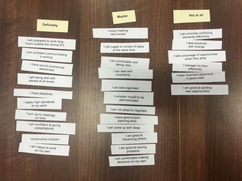
We completed a quick exercise looking at ourselves and documenting where we are starting from. Our own personal baseline mix. We had to choose out of a list of statements which ones apply to us and categories them into definitely, maybe (sometimes) and not at all. Here’s mine.

img_3993.jpg

Its made me think over the last few days – theres a lot of statements to address here, but in particular I’d like to concentrate on making the most of my time – looking at the usual organisational stuff/ time management/ priorities but more importantly making the most of opportunities when they do arise, taking the chances, being flexible, being decisive, make it happen and developing the creative confidence for my work to reflect who I am – oh and getting organised. I’m probably not the only creative that runs a mile from the order and organisation of paperwork, but I need to try.


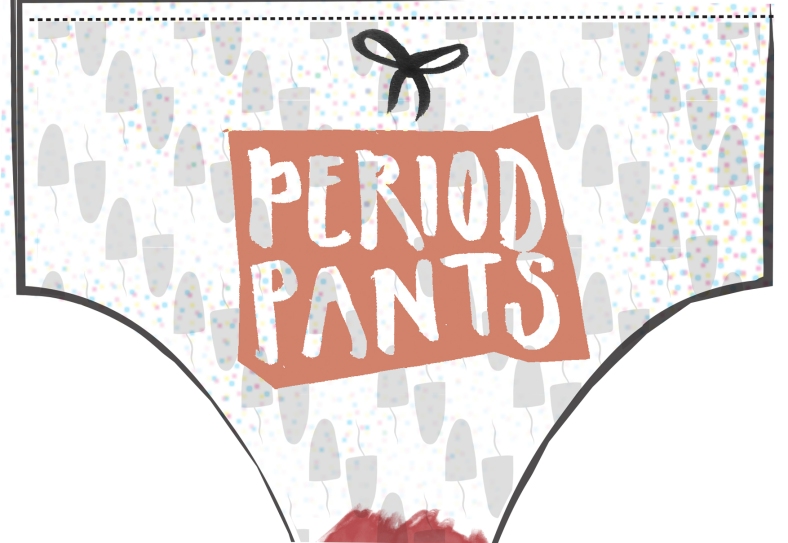
Period Pants_ Taboo Zine

So my latest course brief has taken me to a topic closer to home. Not necessarily more ‘comfortable’ but I’m pretty experienced when it comes to periods. Lets say  having had them for 24 years, in total – I make it about 270 periods I’ve had. On average 5 days long – about 1350 menstruating days. So no pressure then…
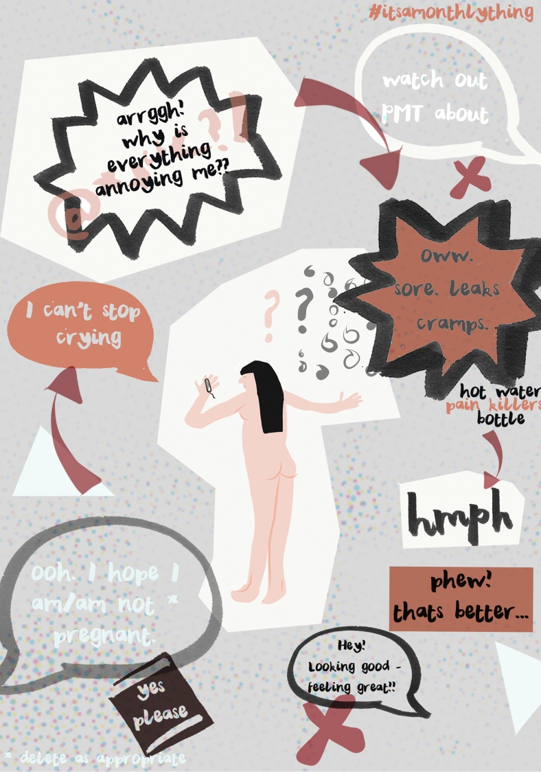
front2
Brief: Create a zine/booklet thats discusses a taboo topic of your choice. The zine booklet must contain a minimum of 8 pages and must suit and reflect the topic chose. 
The topic of menstruation and periods is still taboo.
For many years periods have been seen as being a negative event, a curse. Although we now have better science and understanding along with education and the internet now to put us right, period blood itself is still considered poisonous to humans, animals and plants in certain cultures around the world and there are many unbroken myths impacting women every month. For example, in Nepal women are banished to a small Chaupadi shed away from the house as it is seen as disrespectful to enter. In India, if a woman is on her period she is told to avoid cooking, as she will pollute the food.
Aside from the more extreme beliefs, in the UK there is still a barrier to women talking openly both between themselves and with men about periods. Finding a tampon is often a secret mission around the office. Why do women feel uncomfortable telling people ‘I’m on my period’? Luckily the irrational beliefs of the 19th century that menstruating women would mean butter wouldn’t churn, ham wouldn’t cure and wine would turn to water have long since been dispelled, but there is an element of it lives on.
In the current day advertising has a lot to answer for telling us to be discrete, keep it secret and whisper. Even the ambiguous floral swirly packaging is centred around keeping it all hush-hush.  Why do we need a special sanitary pad shaped tin to keep towels in – nicely hidden away? Why is it embarrassing if a tampon falls on the floor when you’re pulling your purse out of your overladen handbag?
Recent media campaigns have highlighted the issues with free bleeding demonstrations, as well as social media campaigns around Menstrual Hygiene Day, hashtags #menstruationmatters #periodpositive and regularly posted instagram photos of #periodblood which are trying to raise worldwide awareness.
Thankfully in the UK women relatively nowadays unchallenged in their bleeding, but the worldwide issues remain. This zine helps to educate as well as normalise periods. It emphasises its a perfectly natural process that affects all women different ways as well as adding real life experience. Getting both sexes talking periods is the first step to breaking down taboos. Education challenges ignorance and promotes a willingness to learn more.

thoughts illustration

On with the show

So we’re back. The summer is finally over and the latest adventure into graphic design has plunged into motion graphics, videos, after effects, media encoder, .mov .mp4, render queues, hairy pears, printmaking and poppies. I’m glad to have some direction again, even if it is quite dauntingly new.

As an exercise we had to research and summarise a video/ article about Stefan Sagmeister. Among a bit more background research I watched ‘Don’t take Creativity for Granted’ an 11 minute film which takes a tour through a range of Sagmeisters work based in New York and Indonesia design studios, which was published in 2012. To develop critical writing we’ve been asked to summarise it in no more than 100 words.


screen-shot-2016-09-20-at-22-04-31

(video link)

Stefan Sagmeister. Don’t take Creativity for Granted. (2012)

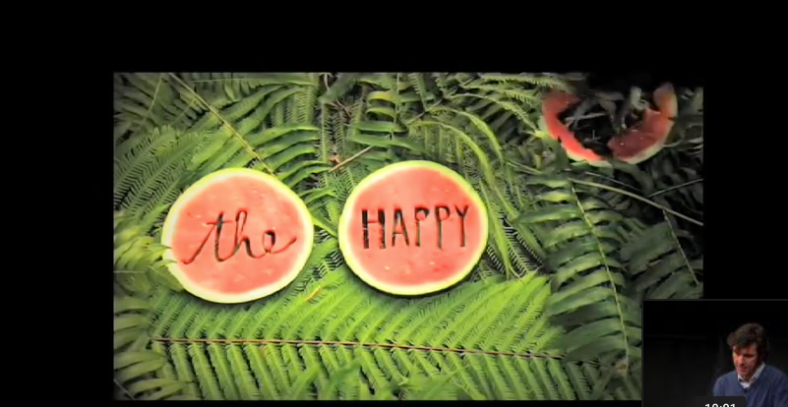
This takes us on a quick tour through a variety of Sagmeisters design projects originating from a personal diary reflection noting ’over time I get used to everything and start taking it for granted’ prompting Sagmeister to do things he’d never done before in NY. Video clips expose inventive, brave, dangerous, elaborate and most importantly provocative typographical based work which show Sagmeister pushing the boundaries, challenging himself but equally our perceptions of design and designers. He talks us through complex typographic experiments in spiders webs and altogether more relaxed typography using melons, grain and bananas emerging from the Indonesia studio.  (100 words)


The word limit of 100 words was pretty hard going – with difficulty I just got in there, but there was a lot more I wanted to say.

My first summary based on  jotted notes while watching the video was easier and shorter (17 words)-

egotistical

destructive

provocative

playful

inventive

brave

risk taking

dangerous

anarchic

insightful

self important

pushing boundaries

elaborate

contradictory


I’m off to read more about Mr Sagmeister. I think there is a lot to learn from him, as well as the blatant design skills and incredible typographical creativity  he serves to remind us to not stop believing in ourselves and have the courage to try something new, stand out and swim against the tide. Take risks.  Explore.  Be a bit more self centred, be destructive, provocative,  be dangerous. Don’t take things for granted.


Summer Seaside Fun

I’ve been pushing on with pattern design work I just didn’t get around to.

One of my favourite undeveloped ideas was the concept of the reality of seaside life – inspired in part by where I am lucky enough to live now – New Brighton – for a long time a forgotten and dilapidated typical seaside resort in Merseyside; the harsh realities of very real photographs were famously documented by Martin Parr in 1985 with his book ‘The Last Resort’ (Magnum Books). 31 years has seen a lot of change – although a few of the buildings featured remain, the area over the last 10 years has seen great redevelopment and transformation and has taken on a completely new and progressive atmosphere.

Everyday I am inspired by the place and in part I’m sure this is related to knowing both the triumph of once being a national top holiday destination but also the fight it has put up to reinvent itself after much neglect.

Out of this rose the idea of ‘Seagulls and Sandwiches’. The idea that when you’re sitting enjoying the seaside air a seagull will come along with its beady eyes and snatch your anticipated dinner.

I started with a linocut print. Ive then digitally coloured and edited to get a repeat pattern and then chose elements of this with the same colour palette to form a more cohesive collection.


I experimented with colours – I wanted to avoid the typical seaside and nautical colours – the stereotypical nautical blue and white and beach sandy yellow with a light blue sky. I settled on brighter more vibrant yellow and blue and just love the way the 2 work together.


A little refinement of colours and taking beady eyes and sandwich details out I made covers for 3 notebooks and a tea towel with packaging sleeve.

s and s teatowel packaging5


I’m glad I got round to doing this. I am hoping to run with this and produce some tea towels and notebooks for sale through my etsy shop soon. http://www.etsy.com/shop/hairypearpress  as well as develop the range to include more patterns. Next up: fish and chips.

Pat on the back time …

Last week I gave the presentation for the end of the Responsive Professional Practice Own Brief : Surface Pattern Design. It was a great chance to look back and see what I had produced and break it down into the visible steps of the design cycle, even if it was a bit retrospectively in places. Bringing it all together was satisfying – being able to wrap up a lot of work. Ive struggled with the digital side pattern development, so if felt like a mini achievement.

final presentation pdf

I suppose a lot of the design cycle including evaluating and redesign is instinct – if it doesn’t work ‘try and try again’. The more difficult bit is probably seeing it doesn’t work. But I now have a great step by step reference for if I get stuck in a rut – and I can cycle back to the beginning.

I feel like I have learnt a lot in terms of digital skills as well as the surface pattern design, trends, products and applications. Comparing the first patterns I designed with the later ones I found it much quicker, the repeat matches better and I’ve got a better understanding of what is possible with digital editing. I also later in the work produced patterns entirely using illustrator, by using brushes, with textures, and colour palettes.

I really hope to be able to design several new patterns over the summer break, with a bit more of a ‘collection’ in mind of complimenting designs, colours and scales –  and would also really love to do some work experience in this area.

I’ve now got a database of contacts, designers, inspiration, mood boards, printers, merchandise companies, trade fairs, local and national events, and a few retailers, as well contacts through social media on pinterest, instagram and Facebook (@hairypearpress) which will help me keep up to date as well as give me an idea of potential design opportunities locally.


Lets make

Pattern Brief: bearing in mind the time to complete the brief  I’ve decided to focus on 1 product per pattern range. I have split the designs up by the design process;

honesty – ink drawing = screenprinted fabric,

I scanned in a hand-drawn sketch and edited in Ai to produce a repeat pattern square swatch that seemed to work well for fabric. I kept this a single colour to keep the design and printing simple, but also felt the design was strong enough and multiple colours might detract from the simplicity and fluidity of the hand drawn image. I then produced a screen and printed some fabric (link).


cupcake collages = giftwrap, 

Thanks to spoon flower. From acrylic paint I cutout and collaged illustrations, around a teatime theme. I selected 2 cupcake illustrations as the strongest and generated a random repeat pattern using a square swatch technique in illustrator, editing the colours to work together slightly. I uploaded this to spoon flower and they produced the digitally printed roll of gift wrap. I used this to wrap boxes and took and edited some product shots using a dSLR and Photoshop.


waves – linoprint = paper print – I have applied this to a book covers and endpapers.

I’m a big fan of linoprint and really wanted to see about linoprinting onto fabric but also using the lino as a start for digital editing and pattern design.

I quickly found out the at linoprinting directly onto fabric was tricky and time-consuming although nice to have instant results and the effect achieved is completely unique. The larger the block the less prints needed to cover the same area but the larger the block the more likely it is the ink prints unevenly. I made two linoblocks based on a seaside/ nautical theme to echo the shape of waves and printed directly on a dark blue fabric with light blue fabric ink.

However, I’m keen to develop digital editing skills so I scanned in the linoprints and edited them in photoshop. I could then take them into illustrator to develop patterns of various combinations and tiling layouts. I kept colours nautical (blue and white) and printed onto A3 paper. I used the paper while researching bookbinding to produce 2 books using the pattern – as a front and back cover and inside as end pages. One book was a perfect bind and the other was a simple sewn binding.


Ive loved every minute of this brief. Its given me a great understanding of the complexities of surface pattern design, but also helped me to know more about this side of graphic design. Its been really helpful to make new contacts, push myself to try new techniques (screen printing and bookbinding), as well as the editing and production side using photoshop and illustrator – using tutorials from ‘Digital Fashion Print with Photoshop and Illustrator’ by Kevin Tallon (2011, Batsford: London) . Ive also found it really useful to learn about generating product shots and had to think about camera, camera setting, lighting, any additional props and post processing in photoshop.


Patterns : use them or lose them

Continuing with the pattern design brief I’ve now started to look to applying the best pattern designs to products (design refinement and exploration of media and aesthetic options).

I’ve researched a range of designers, focussing on how the patterns are used. What products translate well to mainstream commercial pattern use – possibilities are wide ranging from textiles, clothing, kitchen products (tea towels, oven gloves, aprons), to plates mugs, duvet covers, pillowcases, cushion covers, and even right down to smaller merchandise such as greeting cards, notebooks, keyrings, pencil cases, pencils, mobile phone cases and  even cosmetics (packaging) and temporary tattoos.

Ive found inspiration through visiting Spring Fair retail show (Birmingham NEC) and brands/ designers such as http://www.theprintedpeanut.co.uk/, http://www.victoriaeggs.com, http://www.loveyournation.co.uk,  and looking to the more well established mainstream designers (Cath Kinston, Orla Kiely) and their range of products in the high street stores (John lewis). Victoria Eggs has a great range of patterns which are nicely applied to a range of popular products.

This slideshow requires JavaScript.


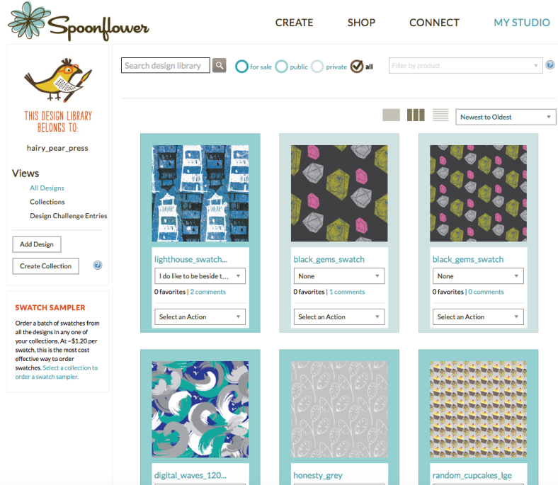
Spoonflower (www.spoonflower.com/UK‎) has been a great resource for pattern research, but also they can produce small fabric swatches, larger fabric rolls, giftwrap and wallpaper.  Ifound it really useful to upload jpeg swatches to ‘My studio‘ and keep a swatch library for the designs completed during this brief (@hairypearpress).

Screen Shot 2016-05-07 at 22.57.56

Since I’ve explored designs using a range of techniques and media like Acrylic cut out collages, ink drawings, watercolour and linoprint, its been great to be able to experiment and then refine ideas. I’ve found it challenging with processing through Adobe illustrator and Adobe Photoshop, particularly in getting the swatch and the pattern to repeat correctly.

I’d really love to see my designs applied to a range of products, but looking at the examples above most limit themselves to a few main items. e.g. Victoria Eggs breaks it up into Kitchen, Homeware, Gifts, Bags and Cards and Wrap. Some ranges have more products than others – probably the better sellers.